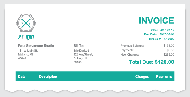
After a lot of blood, sweat, and yes….even a few tears, we’re excited to roll out the first major change to our invoices (and other reports) in over 3 years. Don’t worry, the exact same information is still displayed on your invoices, but we’ve improved the overall layout and styling. We think you’re going to love it.
Any invoice created from this point forward will include the new layout and styling. Go ahead and create an invoice to see what it will look like. Here’s a summary of what’s changed:
- Invoices now include a new « accent » color that adds a personal touch to your invoice. We’ve automatically selected a color based on your logo, but you can change this in your Studio Settings.
- We’ve adjusted the margins on the page to make better use of the space available. Your invoices should feel less cluttered now.
- If you’re located outside North America, the margins on your report will now adjust automatically for A4 (and other page sizes) instead of simply scaling.
- The invoice title and your logo now share the space at the top of the page. If you have a long invoice title and a small logo, everything moves around to make the best use of the available space.
Other changes this week include:
- The Student Portal calendar is now mobile friendly. When viewing the day/week views on a mobile device, the new « List » view is used by default.
- Daily Agenda emails can now be configured to send tomorrow’s agenda. So, if you like to prepare the night before, you can set your Daily Agenda to be emailed any time after 4PM and you’ll get tomorrow’s schedule.
- We updated the Daily Agenda emails to include more details about the day ahead as well. Here’s what’s now included:
- Past lesson notes
- Location (if specified)
- Event category
Did you know? We’ve added a « Policy Agreement » type to the custom Sign-Up form fields (and contact form fields).


